Out with the Oak and In with the New
The homeowners simply wanted a contemporary refresh for the entire first floor of their home and to depart from the golden oak—a ’90s trend—that was everywhere. “It was nice, warm and inviting, but we wanted to bring it into the modern era,” Swenson says.
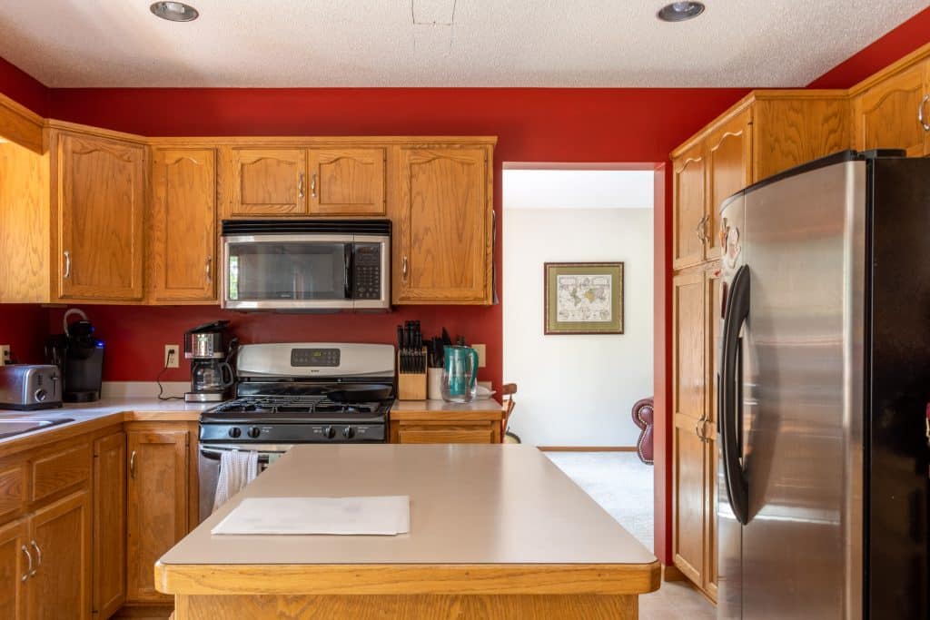
The former kitchen space was home to rich burgundy walls and oak cabinetry and was met with a collection of varying floors pieced together from the entire level—linoleum, tile, hardwood floors and carpet. The laundry room had orange-toned terracotta walls and a nonfunctioning basin sink, and the main entryway staircase showcased outdated oak banisters.

Before the Remodel
Despite such an open layout, founder and co-owner of SpaceTurtle Construction Cody Kupitz says the original main level still felt sectioned off due to the variety of materials and color schemes present. Opting for a more cohesive approach (to also match the basement), the team worked to simplify most of the space with cosmetic changes, like fresh paint, new fixtures and modern molding. “It was dark and dated, and now it’s bright and beautiful,” he says.
Keeping the original blueprint of the home, Swenson says they also carried this simple approach to the general structure of the kitchen (apart from the removal of the built-in desk and the addition of a few cabinets). “We maintained the same layout because we liked how it functioned, and everyone was used to it,” she says. “We just added to and upgraded the overall look.”
The Kitchen
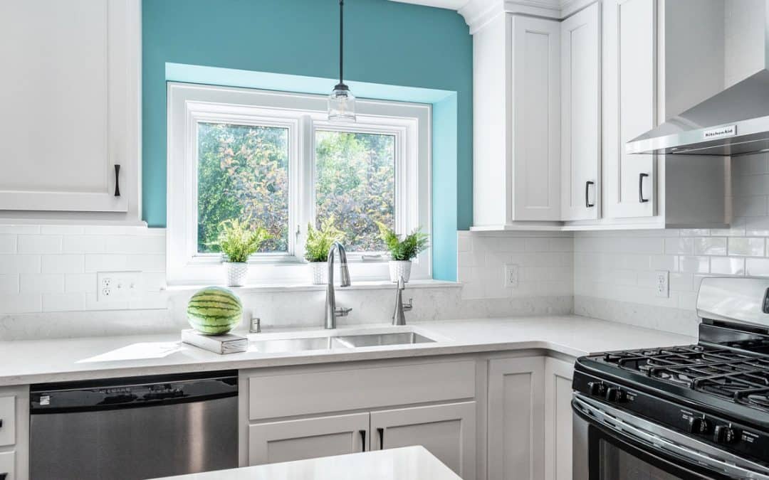
One of the defining features of this space is the pop of color provided by the teal walls. Wanting to add a spruce of personality to the space in a way that was easily changeable, the homeowners settled on a bright, happy paint color.
However, the inspiration for this color was an accident. Swenson says she was browsing through her email when she received a subscribed message from HGTV featuring the iconic teal color in a collection of trending paint colors. Inspired by the email, she says the color stuck with her, and she eventually decided to incorporate it into the new space.
Despite her love for the color, Swenson says she wanted to include it in a way that wasn’t permanent. Featuring it only above the sink and around the entryway to the dining room makes for an easy update in the future. (The subsequent walls in the breakfast nook feature a neutral slate gray to allow for the blue to pop.)

Though it seems like a simple update, the paint created an exciting twist for the SpaceTurtle team. “People are starting to try new things, and we are seeing people go beyond the standard cookie-cutter mold more often,” Kupitz says.
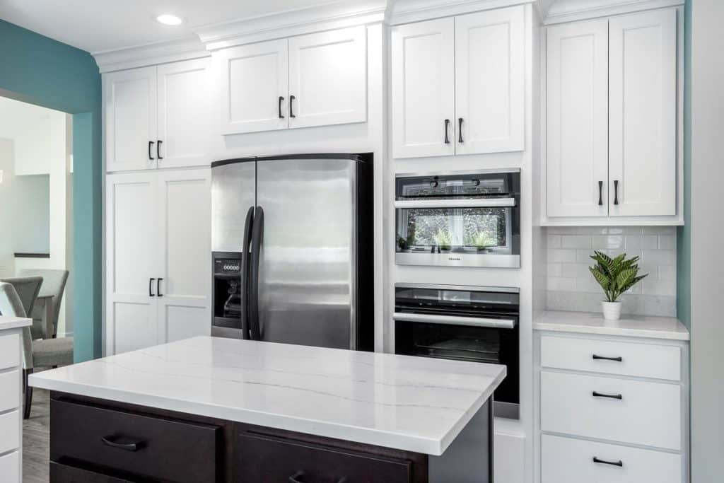
To complement the walls and continue to brighten the space, they settled on crisp white cabinets with black hardware. The espresso toned cabinets used in the kitchen are the same style featured in the basement kitchenette, the laundry room and the guest bathrooms, maintaining cohesion from one level to the next. To contrast, the island, made of birch with a java-colored stain, features a deep chocolate brown to pull in tones from the floors and adds a sense of warmth to the space.
The appliances are another show-stopping feature and Swenson’s favorite part of the remodel. The carefully-chosen stainless steel appliances speak to the homeowners’ passion for cooking and entertaining. The kitchen features two ovens, a dishwasher, a double door fridge and a steamer. Creating one-of-a-kind spaces for their clients, the team at SpaceTurtle values the importance of making a space into a home. “We promote designing the house the way you want to live [and to] get joy out of it,” says Marie Brenden, co-owner and designer. For the homeowners, the team did just that. “[The kitchen is] clean, timeless and functional for our family. It is just a place you want to be,” Swenson says.
With two floors completed, the Swensons are just getting started. They plan to eventually revamp the second level of their home.
Color Pop
In an era of stark white design, color can truly seem daunting. However, it is a great way to bring in a sense of uniqueness to any space. “If you look at a lot of homes now, they are tremendously whitewashed,” Kupitz says. “There are a lot of white walls, white cabinets and it looks good in pictures, but, if you’re living there, you have to make it a place that is comfortable and part of that is through color.”
Using color to highlight personality, the team at SpaceTurtle says it enjoys experimenting with new ways to differentiate its clients from the rest of the homes on the block. “Color can brighten your day, brighten your space and brighten your life,” Kupitz says.
A few favorite paint samples include “Daring,” “Rayo De Sol,” “Carnelian” and “Poseidon.” The pop of teal in the Swenson’s home is “Dragonfly.”
Favorite Features
Brenden’s pick: The former windowsill above the kitchen sink was home to—you guessed it!—a slab of golden oak. As a unique lookout, the homeowners liked to use this illuminated alcove as a space to house some of their favorite plants. However, the water from the pots would seep into the oak and caused the wood to rot. In the renovation, Brenden opted to continue the use of the granite countertop, folding it over the ledge to provide a sleek way for the water to drain off into the sink.
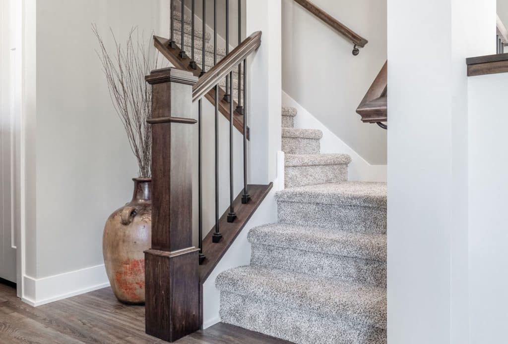
Kupitz’s pick: Aside from the family’s two cute dogs, Kupitz says his favorite feature was the renovation of the stairwell. As the first thing you see when you walk into the house, he says it was almost necessary to give it a revamp. Originally made entirely of wood, it was redone to incorporate the same chocolate tone as the kitchen island for the banisters and thinner medal spokes to create a lighter feel.


